Clashing Colour Schemes
Clash Colours on your wedding day
Your colour scheme is the perfect chance to inject some personality into your wedding day, and clashing colour schemes are a bright new trend that is just impossible to ignore.
We spoke to three wedding photographers about their favourite colourful weddings, to get inspired by the beautiful and bright weddings they had captured.
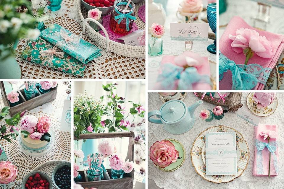
Marianne Taylor, of Marianne Taylor Photography, loved this clashing pink and turquoise wedding colour scheme. She worked on this shoot with Steph from Fairy Nuff Flowers, and said of it: “I’ve been obsessed with a pink and turquoise colour scheme for a while, so that was our starting point. After a long time of planning, and collecting items for the shoot, we were surrounded by so much beauty that represented exactly the kind of things we would love to see at real weddings.”
Pink and turquoise is the ideal colour scheme if you want something bold and bright, but still feminine. It will work all year round, and as shown in Marianne’s images, suits a vintage tea party wedding theme especially well.

Lisa O’Dwyer, from Lisa O’Dwyer Photography, captured these images from a wedding which took place at Mount Wolseley. She describes the bridesmaids as “looking radiant, in jewel tones, with colourful bouquets”. A jewel toned wedding is a great way to use lots of colours which complement each other well. Simple bouquets were accentuated with a quirky touch, by including one coloured flower. This is a great way to brighten up a simple arrangement.
Allowing your bridesmaids to each wear a different style of dress is a great way to have their personalities shine through, and choosing contrasting colours is a fresh way of brightening up your wedding photos.

Julie Cummins, of Julie Cummins Photography, shot this gorgeous wedding in County Meath. The bride and groom opted for a vintage theme with lots of colour, which worked well at the quirky venue. The bright purple door made an excellent backdrop, and splashes of colour made the stationery stand out.
Julie said of this beautiful wedding: “Everything was quite random, colour wise, but oh-so-pretty. It was very reflective of their whole wedding, and fitted in perfectly with the personality of their venue, The Millhouse”. You don’t have to just pick one or two colours; by choosing lots, you give yourself so much more to work with.


